In a market where digital demands are evolving faster than supply chains, Hackle is a tech-forward ally that understands the front lines of modern retail.
CLIENT
Hackle
PROJECT
Brand Strategy
Visual Positioning
Website Collaterals
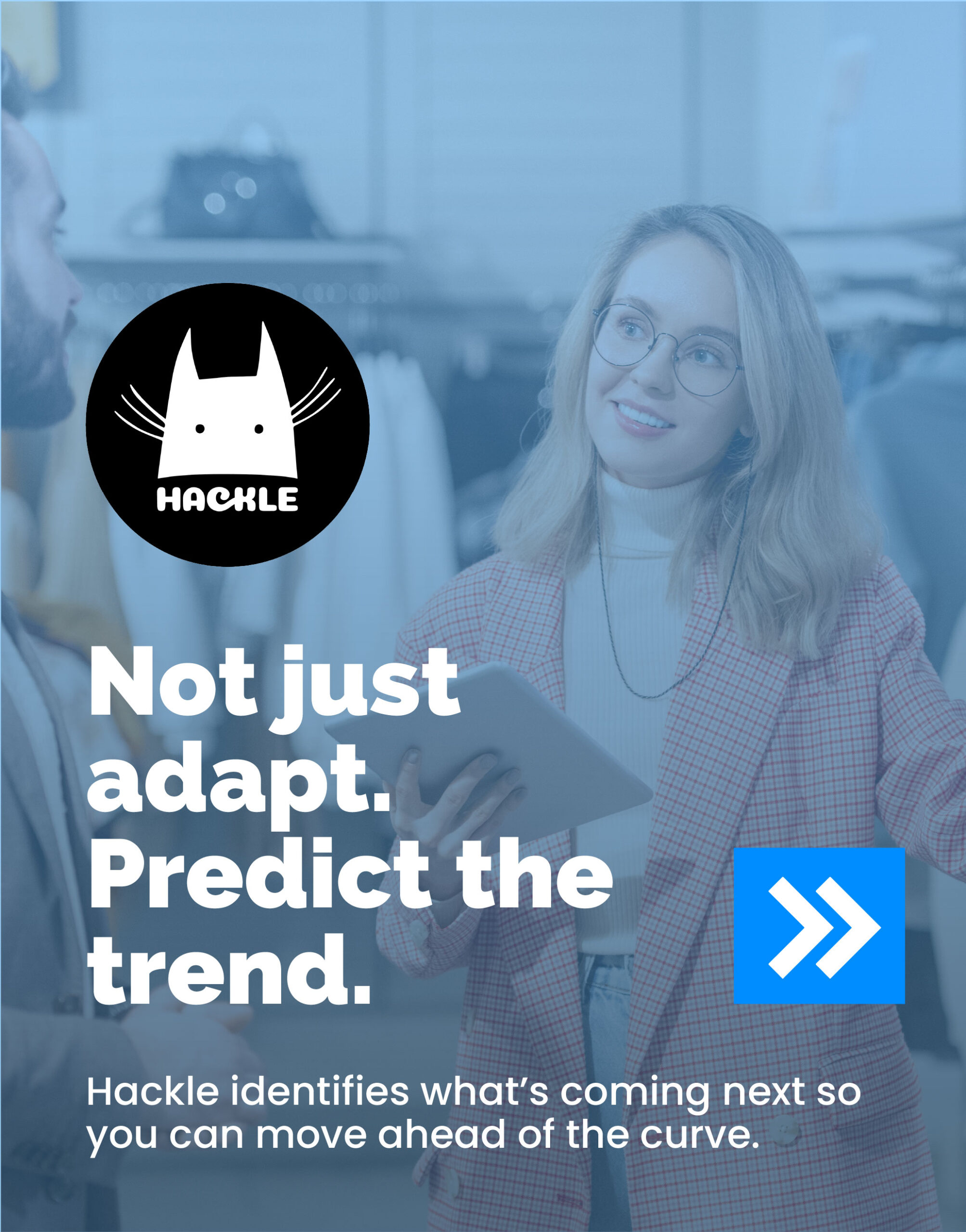
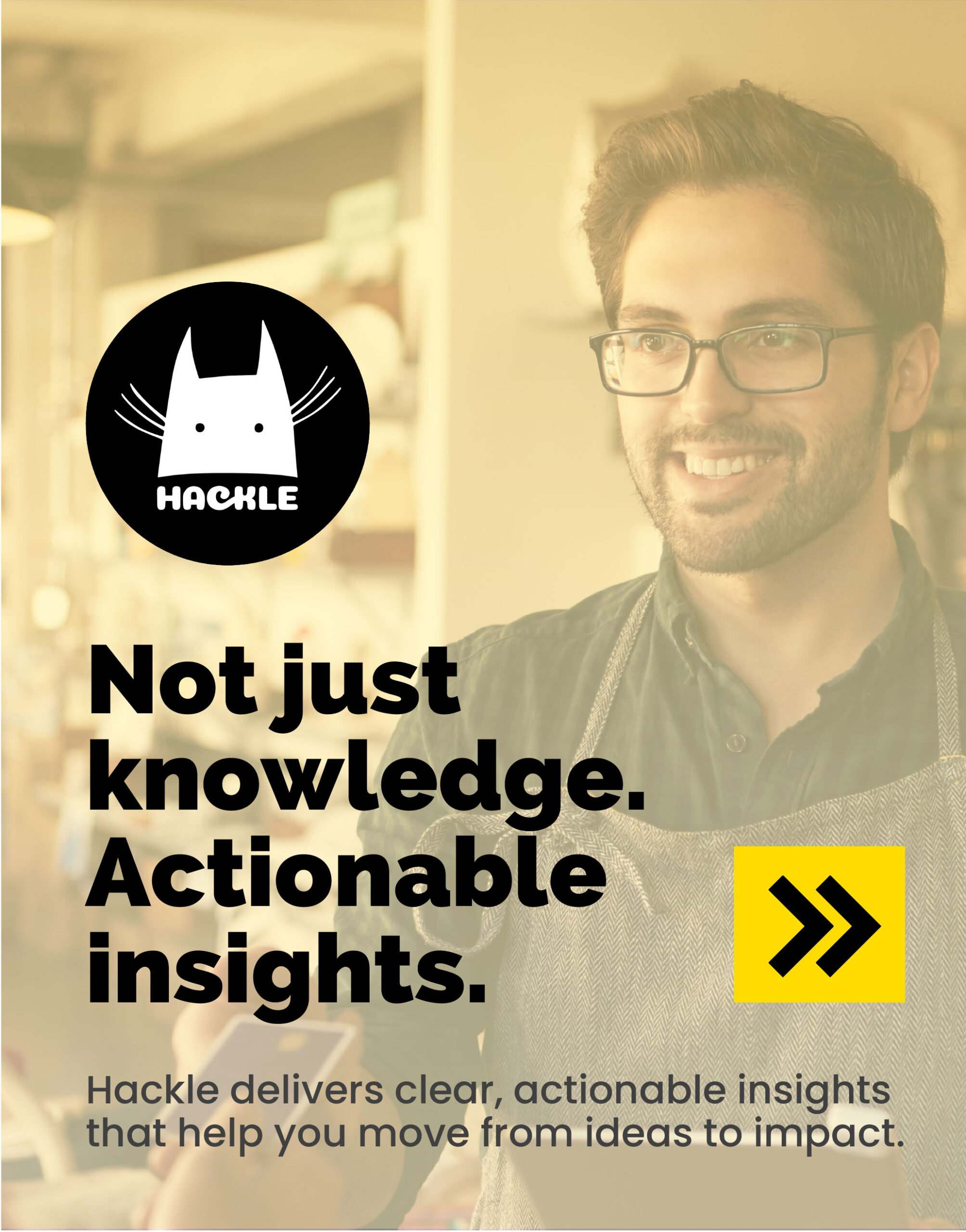
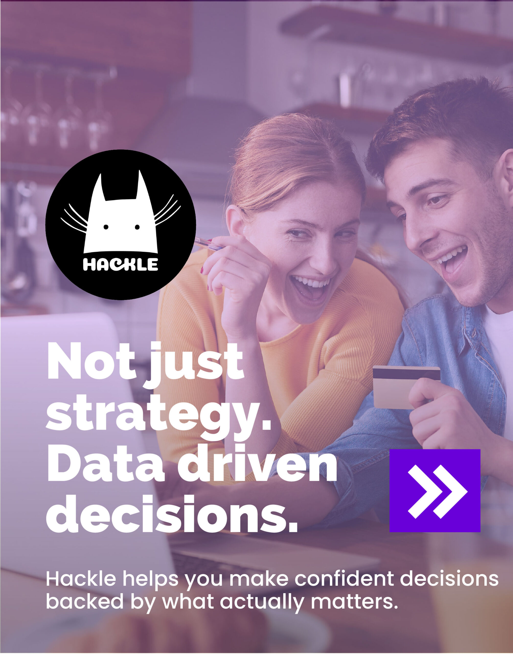
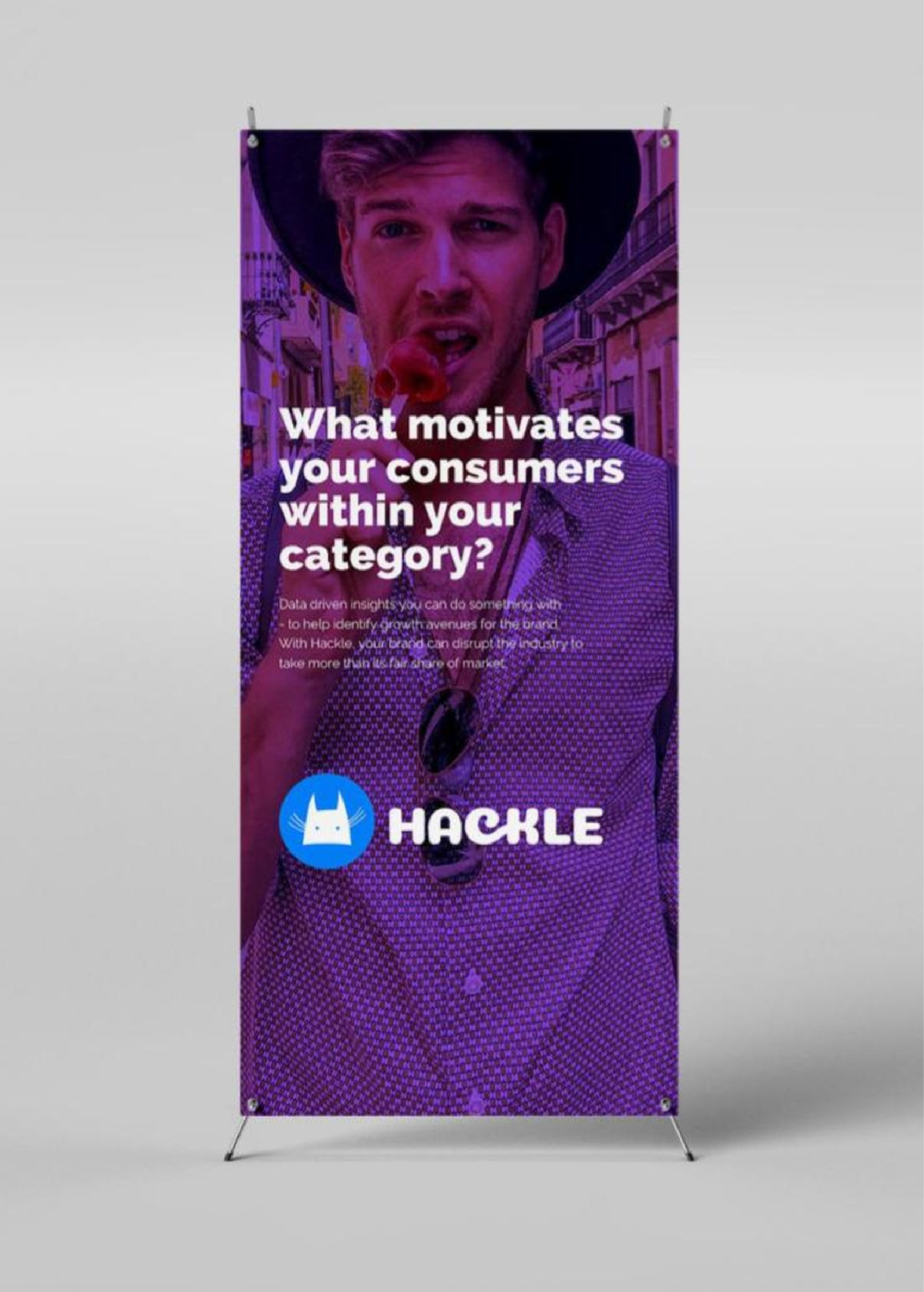
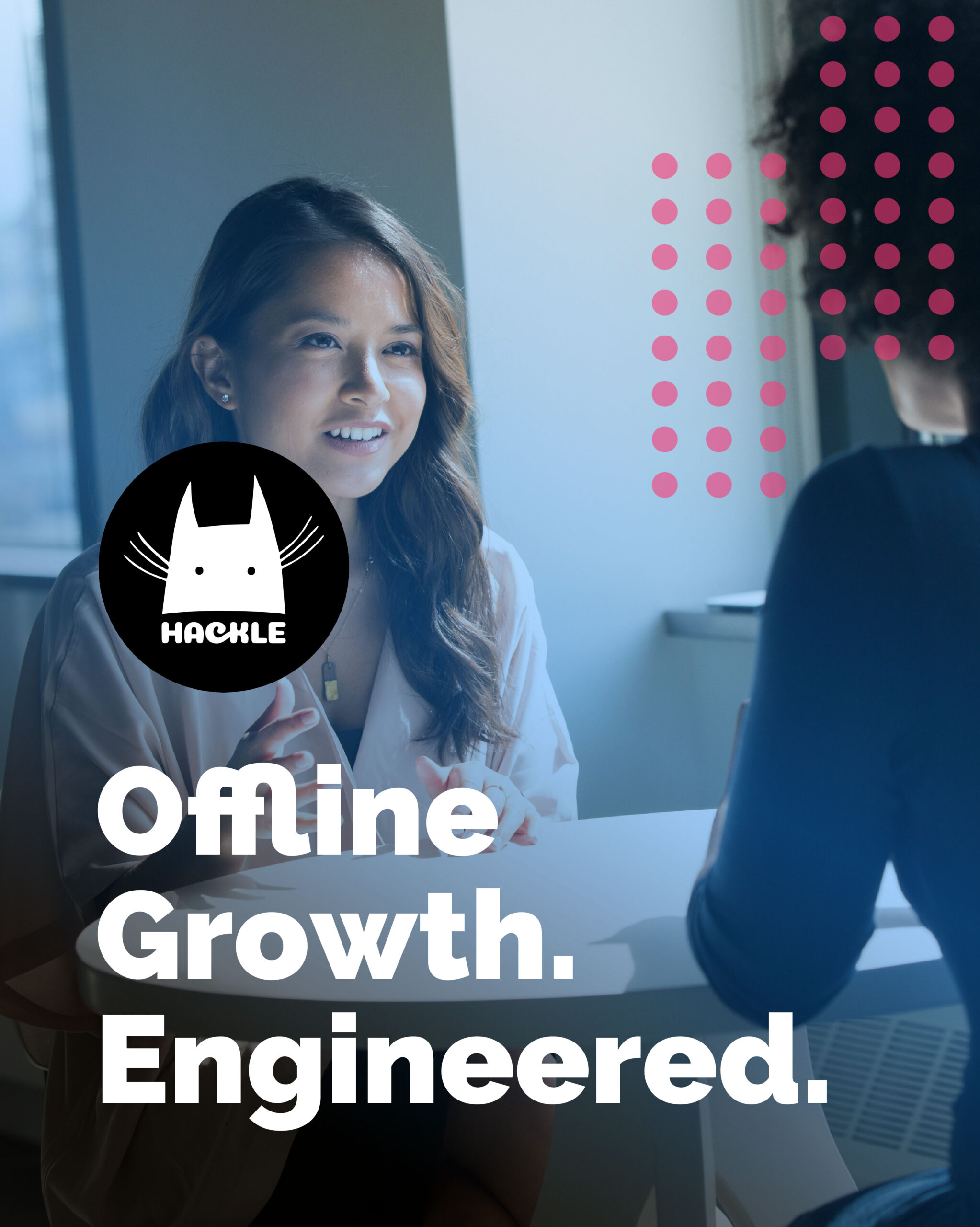
The name Hackle was born from a simple, instinctive image: the moment a cat’s hackles rise in response to a shift in its environment. It’s a gesture of heightened perception and readiness, signaling a brand that stays perpetually alert to the movement of the market. In an industry often defined by quiet invisibility, the goal was to trade passive service for a sharper, more active presence.
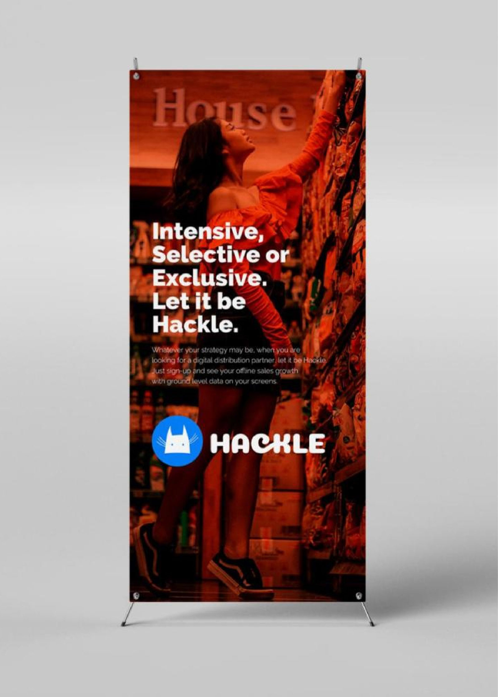
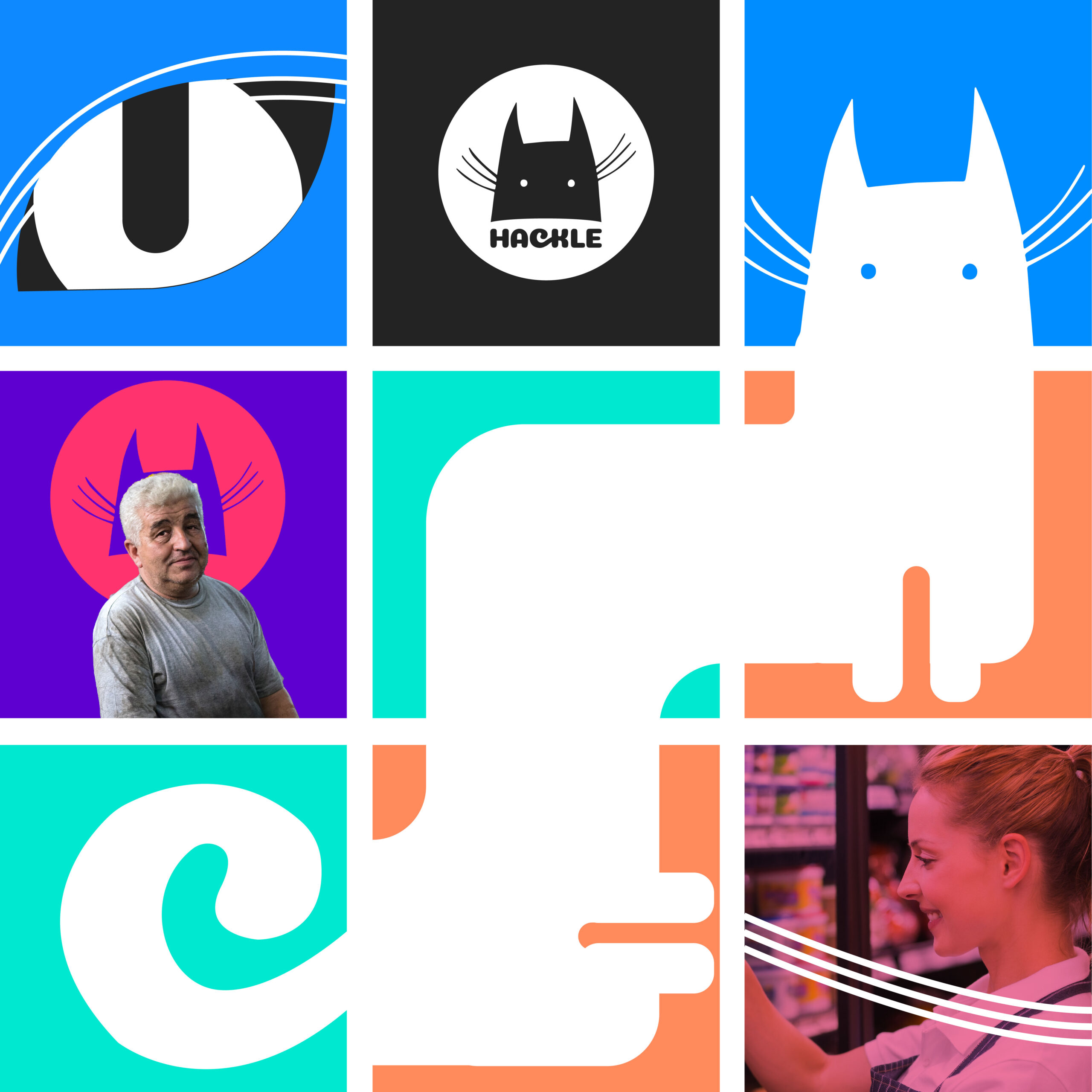
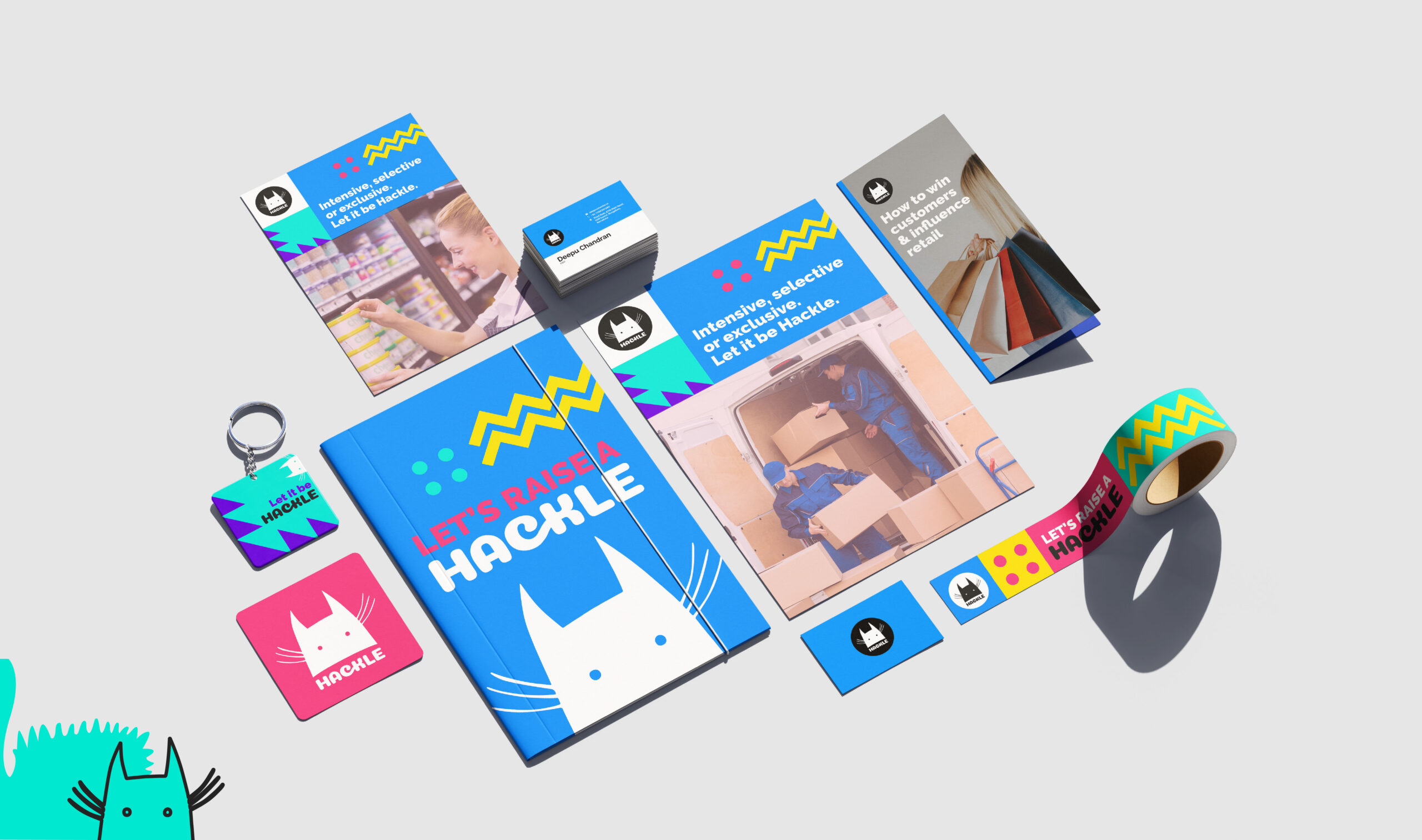
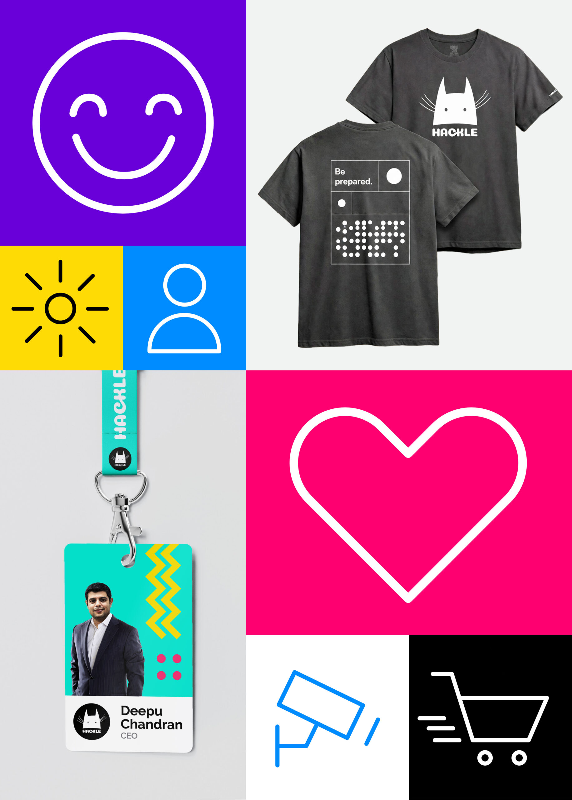
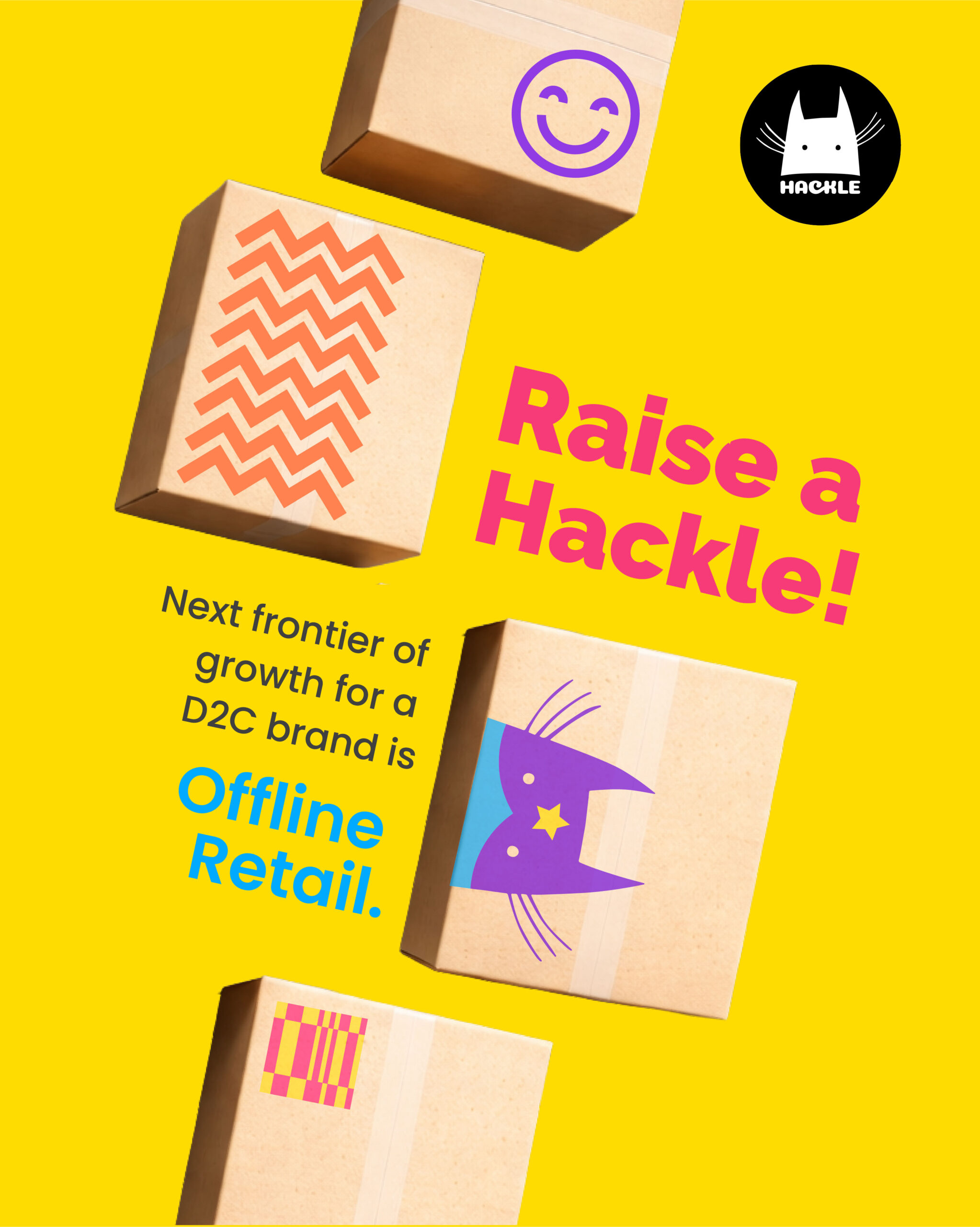
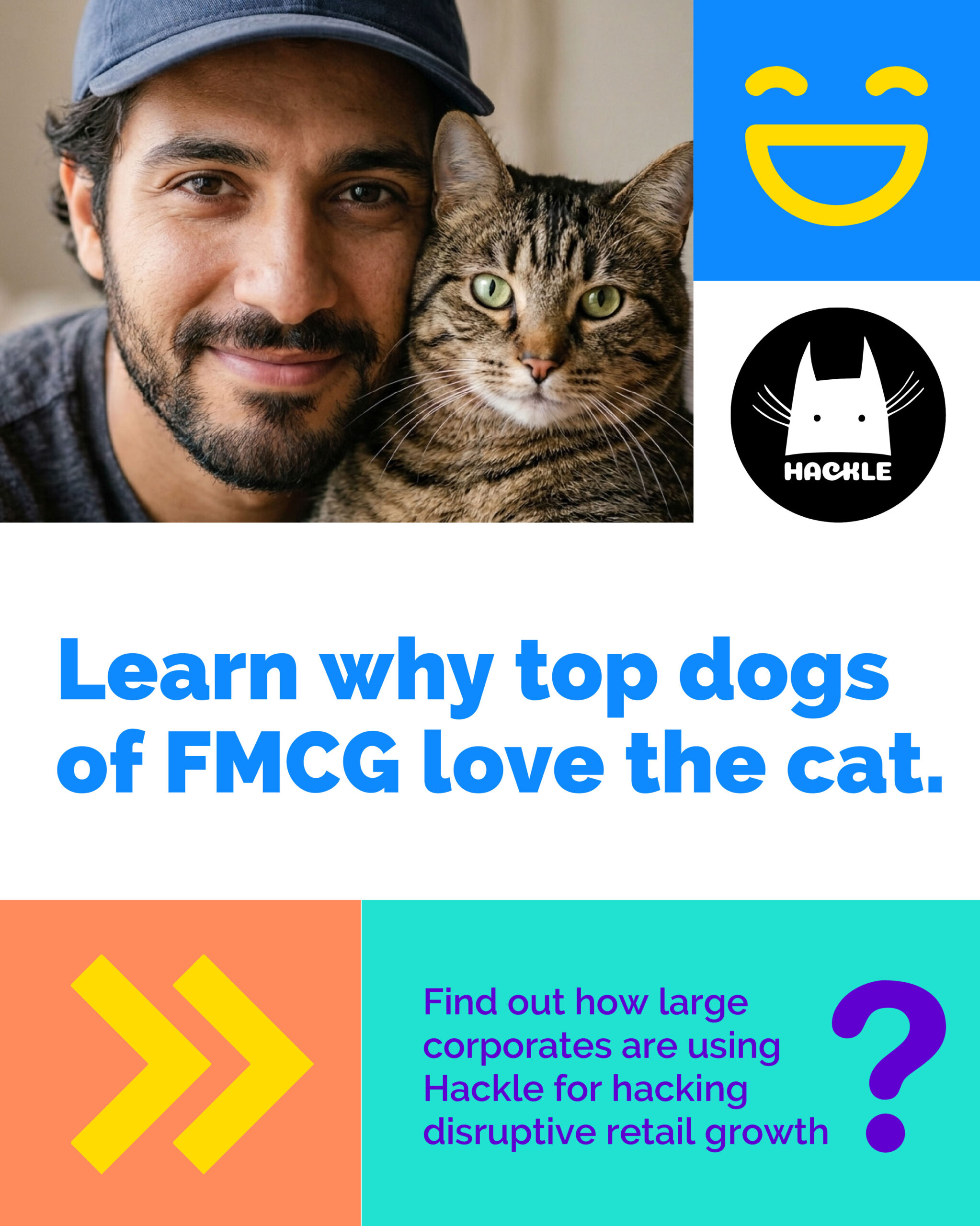
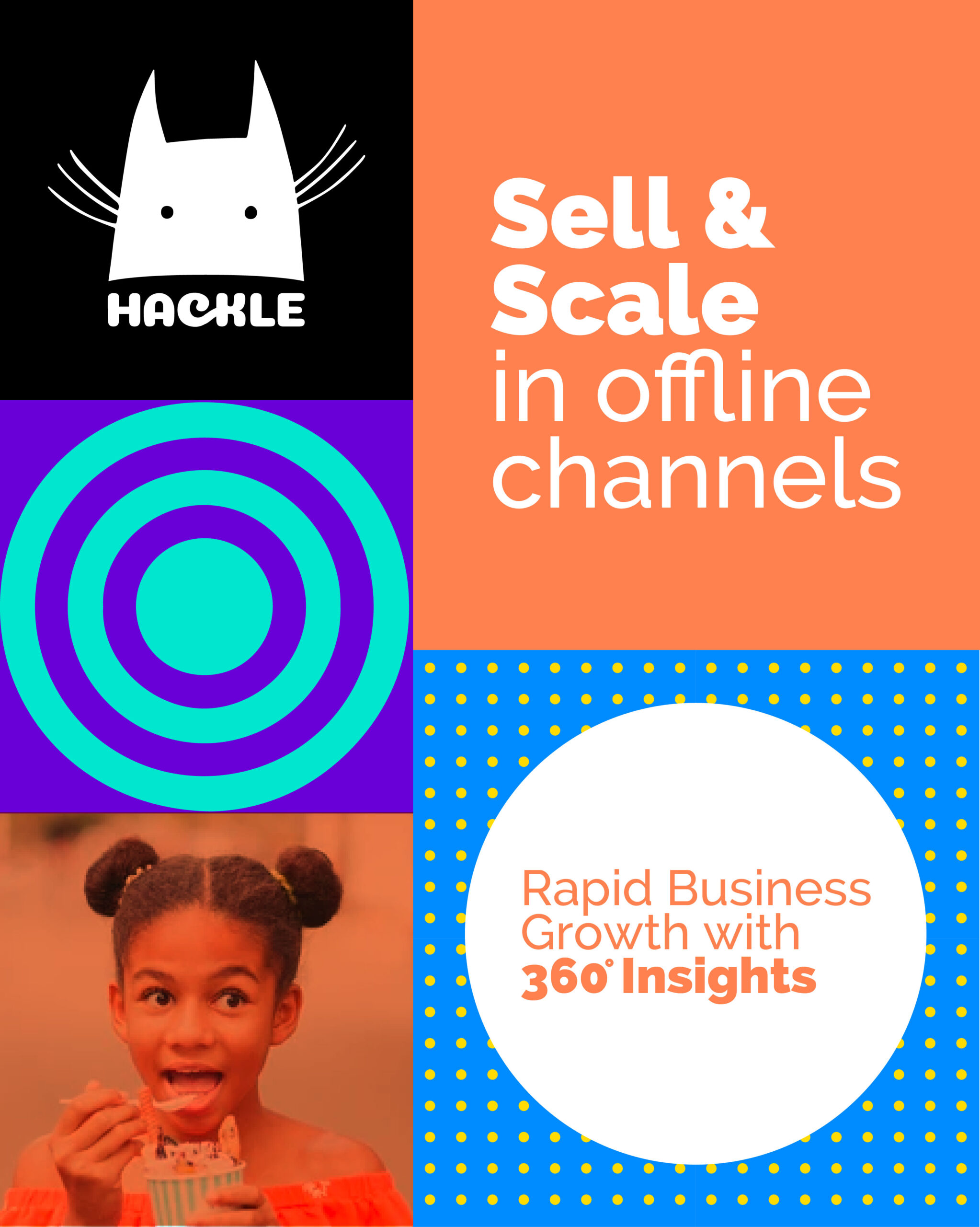
The “Hackle Cat” stands as a symbol of the precision and agility required to navigate complex distribution networks. Leaning into a saturated palette and a high-energy digital blue that feels native to the tech world, the visual system was designed for immediate recognition through a singular character mark that maintains its edge from small app icons to large-scale fleet with a vibrant, backlit aesthetic.
The brand narrative shifts from ‘trucks and warehouses’ to ‘intelligence and agility.’ The identity signals a deep understanding of the digital requirements of today’s D2C market, demonstrating that a brand can lead with instinct and raise a response.
A brand narrative shifting from trucks and warehouses to intelligence and agility.
—

A visual language that reacts to market shifts with the precision and speed of a living organism.